Software
Control Charting Integration with Process Capability and Enhanced KPI Reports
If there are common causes of variability and the product is not meeting customer needs, process improvements are needed to improve the product quality.

Image Source: Marco VDM / E+ / Getty Images
Even though traditional control charting techniques have existed for over 100 years, some critical mathematical properties of these charts can lead to organizational applications that are wasteful and harmful.
This article will use a dataset from Minitab’s website to highlight potential control-charting issues and provide an alternative using a free 30,000-foot-level metric-reporting app.
This report will use Minitab software for statistical analyses, e.g., Analysis of Means (ANOM) and probability plots.
The Reference Section at the end provides insight into the benefits of 30,000-foot-level reporting and its free reporting app.
Control Charting Techniques Enhanced: Example Data Set
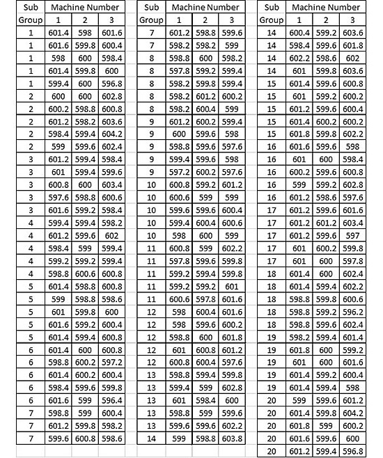
The following dataset from the Minitab website’s support section illustrates the creation of an xbar-r chart. In this example, three machines manufacture products from three shifts daily. There was a measurement of five parts from each machine during each shift. This set of measurements formed a subgroup in the Minitab example.
We will use the dataset shown in Table 1 to compare traditional control charting techniques, as illustrated in the Minitab website example, to a 30,000-foot-level charting alternative that uses a free app for the chart’s creation.

Traditional Control Charts
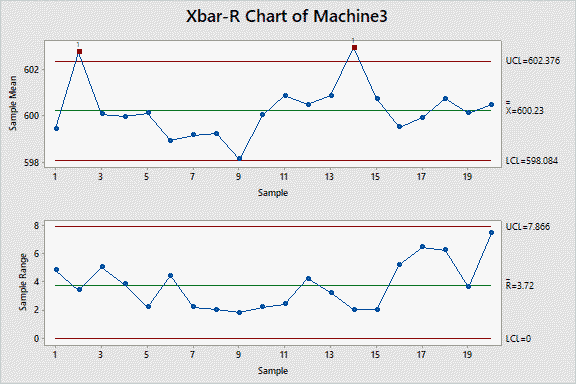
A traditional control charting technique approach for this dataset would be to create an xbar-r control chart for each machine to monitor the product and identify special cause conditions that may need corrective action. Figures 1-3 show this chart for each machine.


These traditional control charts indicate that Machines 1 and 3 are not in statistical control as special-cause signals occurred, i.e., one or more responses beyond the upper or lower chart (UCL and LCL) limits; Machine 2 chart shows it is in control as no special-cause signal occurred.
An organization can spend a lot of time (wasting valuable resources) investigating a process’s special-cause signals without making any beneficial changes to the process that enhance future-produced product quality relative to customer needs.
For the example above, an Engineer could try to determine why machines 1 and 3 are out of control and what to do to understand the out-of-control condition. Any out-of-control conditions could be due to chance when nothing abnormal occurs, and only common-cause variability exists. This effort would result in wasted resources and probable frustration.
An alternative 30,000-foot-level metric reporting methodology overcomes the shortcomings of traditional control charts and process capability reporting. With the 30,000-foot-level reporting, one is not attempting to “control” a process and identify special-cause signals for resolution. With 30,000-foot-level reporting, the individuals chart* only assesses whether a process is stable (or not) from a high-level vantage point. When there are no points beyond the data calculated UCL (upper control limits) and LCL (Lower control limits), as in the report-out below, the process is considered stable and predictable from this high-level perspective (not unlike examining the terrain below from an airplane in flight).
* See Reference 2 at the end of this article for a mathematical explanation of why an individuals chart is appropriate for this situation.
A Customer Perspective
From a customer perspective, any difference between machines should be considered a source of common cause variability since a customer does not care what machine manufactured the product. If customers do not receive quality parts from a particular machine, the process of that machine needs improvement.
Common cause variation should be normal variation within the process. From this perspective, any difference between shifts, days of the week, or machines is a source of common cause variability.
If there are common causes of variability and the product is not meeting customer needs, process improvements are needed to improve the product quality.
The Real World: Customer Needs and Process Capability
The 30,000-foot-level metric describes a high-level project or operation metric with infrequent subgrouping/sampling so that short-term variations, which might originate from typical variation in input levels, will result in charts that view these perturbations as common-cause issues. An important factor in creating the 30,000-foot metric chart is how the subgroups/sampling are selected.
For example, if one were to subgroup by shift and there is a difference in shift, this could result in special-cause signals. Any difference between shifts should be a source of common cause variation. If the magnitude of the difference is affecting quality, there is a need to make work-day shifts perform more similarly through process improvement. If the response differs by day of the week, we would need to subgroup by week because any difference in day of the week should be a source of common cause variability. If a particular day of the week is causing customer dissatisfaction, we need to improve the process for that specific day of the week.
Again, for the Minitab example dataset, an analysis from the customer perspective, any difference by shift and machine should be considered a source of common cause variability since customers do not care what machine the product came from. If customers are not receiving quality parts from a particular shift or machine process of that machine, there is a need to improve this portion of the manufacturing process.
It is essential to understand that the process of producing a product could be in control (statistically) while producing NO product within customer specifications. Reiterating, a customer of this product does not care whether Machines 1, 2, and 3 are in statistical control. Customers want products that fulfill their customer specification needs.
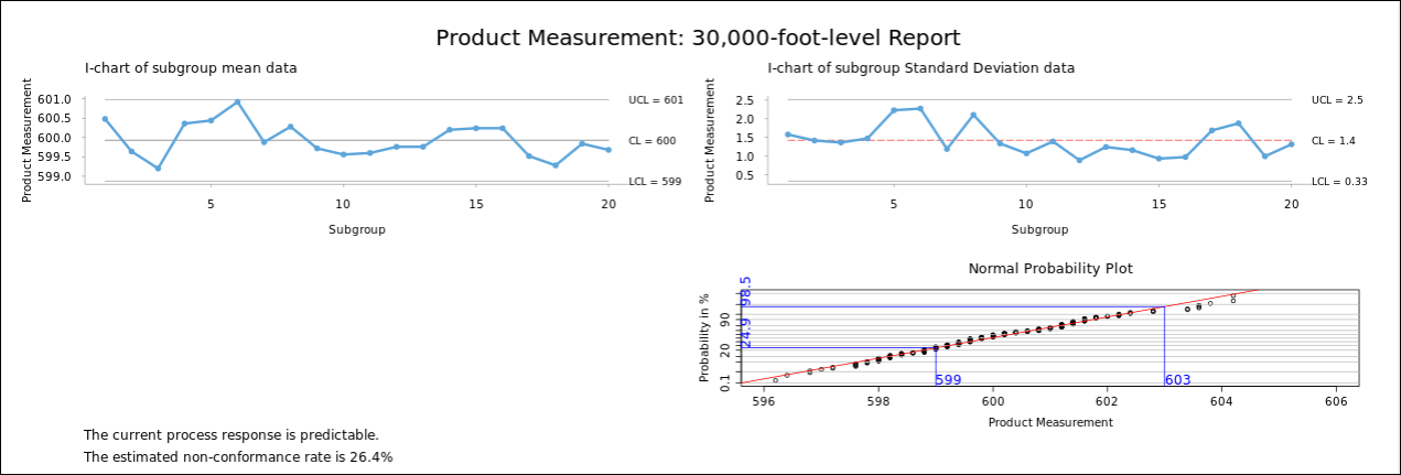
For this illustrative example, consider a product specification of 599-603 also existed for this Minitab dataset. Figure 4 shows a 30,000-foot-level report for this set of data, which contains
- An individuals chart* of the subgroup means and standard deviation, where there is the consideration that a process is stable if no datum points are beyond the UCL and LCL lines.
- A probability plot of all the data with process specification lines, where this plot provides a process capability assessment, which has many advantages over process capability indices reports
- A statement at the bottom of the charts provides a prediction statement for stable processes, where if a prediction statement is undesirable, there is a need for process improvement).
* See Reference 2 at the end of this article for a mathematical explanation of why an individuals chart is appropriate for this situation.

Unlike the previous control charts, a 30,000-foot-level chart indicates process stability from a customer’s perspective (upper two mean and standard deviation individual charts). The probability plot (lower right corner of data) provides an expectancy frequency of occurrence beyond the specification limits of 599 and 603. This report also provides an estimated non-conformance rate statement at the bottom, which is about 26% now (and in the future) unless there is a change to the process inputs. This non-conformance rate reporting statement is much easier to understand than traditional Cp, Cpk, Pp, and Ppk process capability indices (See Reference 3). If this futuristic non-conformance rate is undesirable, there is a need for process improvement.
Process Improvement
Consider that the output of a process is Y. The magnitude of this process output is a function of its X inputs, which include the process steps to create the Y response.
The previous 30,000-foot-level report (Y) provided an estimated non-conformance rate of about 26%. Consider that a Cost-of-Doing-Nothing-Differently (CODND) analysis estimated a monthly cost of $10,000 from this 26% non-conformance rate. Since the organization considered this CODND $10,000 monthly amount excessive, management realized there was a need for process improvement.
Statistical analyses can provide insight into improving a process, e.g., a hypothesis of whether an X value affects the Y response.
Two brainstorming session ideas for concentrating process improvement efforts were “Shift Number” and “Machine Number.”
Figure 5 shows a Minitab Analysis of Means (ANOM) assessment for “Machine Number” Xs. You could similarly conduct an ANOM for “Shift Number.”

An ANOM statistically compares each X-response level to the overall mean response from all X values. If a mean value is above or below an ANOM red-line decision level, one rejects the null hypothesis that this X-level response’s mean response equals the overall mean response for all X values. This statement is made with the alpha probability value of being incorrect, as shown in the chart’s header.
ANOM analysis conclusions:
- Machine 2 null hypothesis of equality of mean response to all machines mean is rejected (on the low side)
- Machine 3 null hypothesis of equality of mean to all machines mean is rejected (on the high side)
Understanding why these differences occur can provide insight into improvement actions to reduce the overall non-conformance rate.
A probability plot (Figure 6) can provide insight into how each machine impacts the overall 30,000-foot-level metric report-out. This figure includes specification limits for reference.

Conclusions from this plot:
- Machine 2 appears to have less variability than the other two machines. Doing something differently to increase the mean for Machine 2 could result in all data measurements from this machine being within specification.
- Understanding why Machine 2’s variability appears less than the other two machines can provide insight into what might be done to the other two machines to make them perform better relative to fulfilling the customer’s specification needs.
Process Capability Reporting When There Is No Specification
The free 30,000-foot-level app (See Reference 1) offers an easy-to-understand process capability statement in the same chart, even when there is no response specification. For this no-specification process capability statement, the report-out provides a best-estimate mean or median response level and 80% frequency of occurrence rate.
Demonstration and Quantification of Process Improvement or Change
The staging of a 30,000-foot-level report shows and quantifies a change in a process output response. Predictive statements at the bottom of the report reflect the process-output response (e.g., non-conformance rate) after the change.
Process Improvement Projects that Benefit the Big-picture Finances
Within the 9-step Integrated Enterprise Excellence (IEE) system (See Reference 3), step 6 includes the creation of an Enterprise Improvement Plan (EIP) that provides organizational metrics to improve via process improvement projects so that an organization’s overall finances benefit.
Reporting 30,000-foot-level Metrics with the Processes that Created the Metrics
- IEE, among other things, reports 30,000-foot-level metrics for a function with the process that created it – in one chart.
- The Enterprise Performance Reporting System (EPRS) software (See Reference 3) provides an IEE deployment behind an organization’s firewall with automatically updated 30,000-foot-level metrics.
Conclusion
Traditional control charting techniques provide no insight into how a process performs relative to fulfilling customer needs. Control charting can lead to wasted organizational efforts and frustration, as shown in this example.
Traditional process capability studies of continuous-response data to address customer specification needs are separate analyses from control charting. Traditional process-capability studies provide process capability indices (Cp, Cpk, Pp, and Ppk) that are difficult to understand (and have some technical issues). For valid capability analysis statements, the process of determining indices must be stable; however, the control chart that assesses process stability is separate and may not be stable.
30,000-foot-level reporting has many advantages over the separate analyses of traditional control charting and process capability studies. 30,000-foot-level reporting provides an assessment of process stability in one chart with a predictive statement that is easy to understand, e.g., non-conformance rate. If a futuristic 30,000-foot-level statement is undesirable, there is a need for process improvement.
References
- A 30,000-foot-level free app (with video instructions on how to use it) is available through the link "Free Business Process Management Software."
- Issues and Resolution to xbar-r chart Formula Problems
- Process Capability Problems and Solutions: Resolving Process Capability Index Issues for Cp, Cpk, Pp, Ppk
- Thirty References for 30,000-foot-level Metric Reporting and Integrated Enterprise Excellence (IEE)
Forrest W. Breyfogle III is founder and CEO of Smarter Solutions Inc. (Austin, TX). Adilson Inocencio is a quality engineer at Amphenol Alden in Brockton, MA. For more information, e-mail forrest@smartersolutions.com, call (512) 918-0280 or visit www.smartersolutions.com. To discuss the potential benefits of 30,000-foot-level metric reporting or IEE in your organization, schedule a video meeting session with Forrest through the link https://smartersolutions.com/schedule-zoom-session/
Looking for a reprint of this article?
From high-res PDFs to custom plaques, order your copy today!


